Strengthening brand recognition through streamline design.
Art Direction + Design: Jamal Gamby
Original Design + Illustration: Charlie Burt
Creative Direction: Frankie Oviedo
Account Management: Kat O’Connor
Photography: Samantha Levi
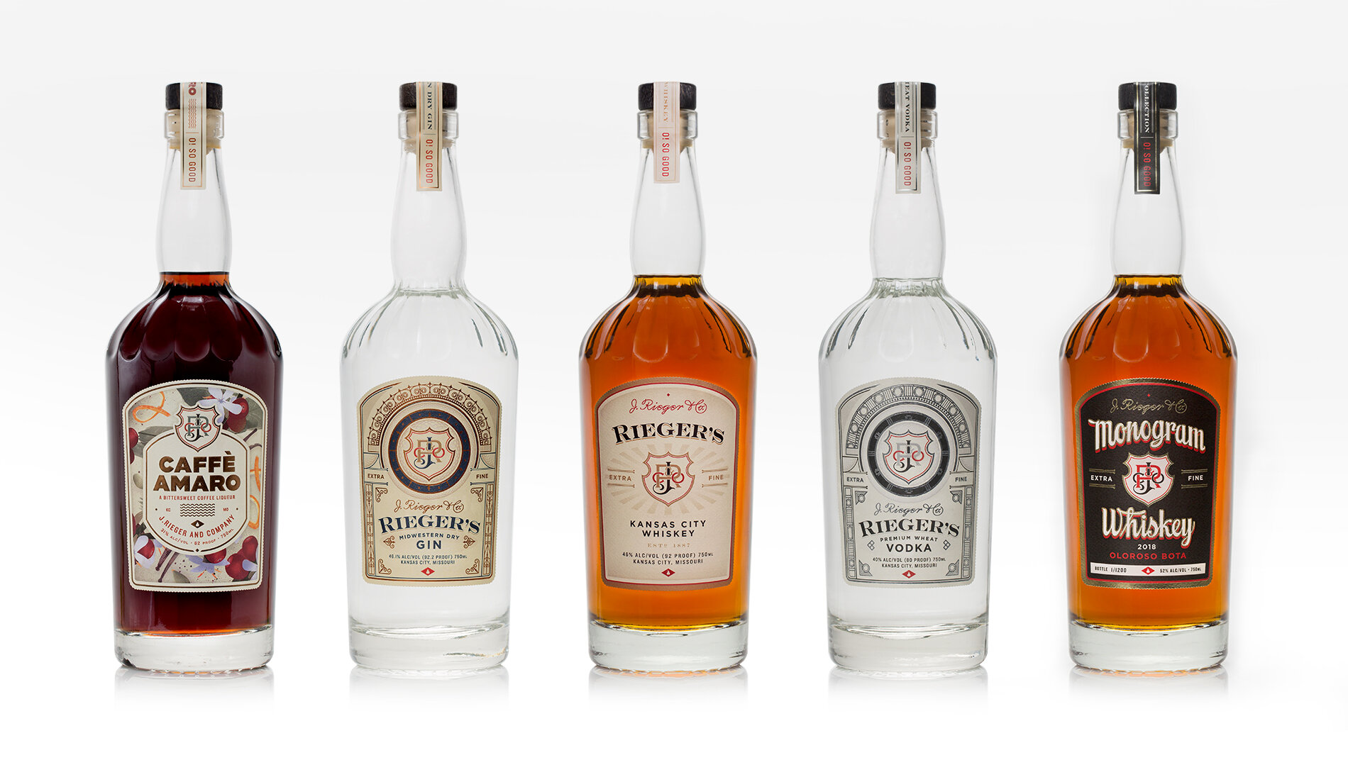
When J. Rieger & Co. relaunched after nearly a one-hundred year hiatus, their Kansas City Whiskey quickly became a local favorite with national attention soon to follow. What they didn’t expect is that their Midwestern Dry Gin would soon steal the show, garnering praise on a national level and challenging Kansas City Whiskey as their flagship product.
The surprise success identified problems in production and brand recognition. The square bottles (used for Gin and Vodka) did not move efficiently through the labeling machine, making it difficult to keep up with demand. The labels for these spirits lacked a clear identifier that tied these particular products back to the brand. The solve was to streamline all of their products moving forward, using the same bottle, label template and name to tie all of their high-volume products together.